
Analysis of the iPhone 17 Pro design critique on the internet
Internet Reacts to Apple’s New iPhone Design
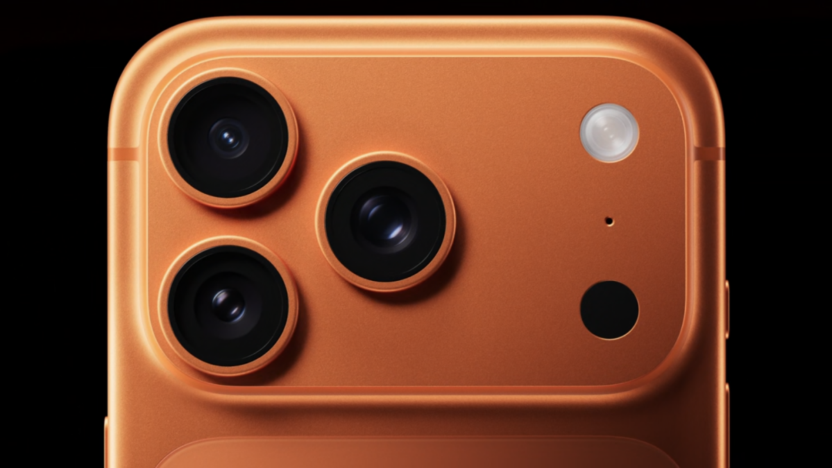
Apple recently unveiled its latest premium iPhones, the 17 Pro and 17 Pro Max, at the highly anticipated “Awe Dropping” event. However, the public opinion on the design of the new iPhone 17 Pro has been less than positive, marking a significant shift for a company known for its crowd-pleasing designs.
Mashable’s Stan Schroeder provided a detailed overview of the new iPhone 17 Pro and Pro Max, highlighting the major design changes from the previous generation. The new phones feature a “plateau” that houses the camera system, with a centered, raised rectangle replacing the previous offset box for the cameras. Additionally, Apple introduced new color options, including “deep blue, cosmic orange, and silver” (navy, bright rust orange, and silver).
Reactions to the Design Changes
Despite Apple’s efforts to innovate with the design of the iPhone 17 Pro, the internet has not been impressed with the plateau design or the color choices, particularly the orange variant. Many online users have criticized the design, calling it ugly. It remains to be seen whether opinions will change over time as people become more accustomed to the new look.
Personally, my opinion on the new iPhone’s aesthetics is neutral, as I prioritize functionality over appearance. For me, the look of the phone is secondary to its performance, and I would likely use a case to protect it. However, the general sentiment online suggests that many users are disappointed with the design direction taken by Apple.
Topics
Apple
iPhone