Opinion: Apple’s Liquid Glass – Not as Intimidating as It Seems!
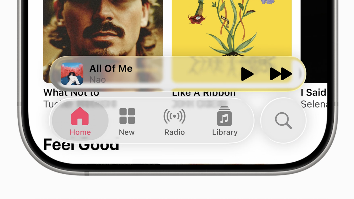
In iOS 26, Apple’s Liquid Glass design has sparked mixed opinions among users. The semi-transparent elements on the iPhone’s display create a cool, frosty look that sets it apart from previous designs. However, some may find the transparency to be too overwhelming, especially when turned up to maximum settings.
Adjusting the Liquid Glass Look
Apple has provided options to tone down the Liquid Glass effect in iOS 26. Users can follow instructions to customize the level of transparency to their preference. The latest developer beta 2 introduced changes to reduce the transparency effect even further, although some adjustments were reverted in the final public beta release on July 24.

Enhancing Visibility
Apple also enhanced visibility in the Control Center by increasing background blur, making icons more distinguishable. The Reduce Transparency option in Accessibility settings further reduces transparency across the entire interface. Additionally, enabling high contrast mode adds borders to floating elements, improving legibility while maintaining the Liquid Glass aesthetic.
The changes in iOS 26 may seem subtle individually, but collectively they contribute to a more user-friendly experience. The public beta release on July 24 expands access to more users, although some bugs may still be present until the final version launches in September.
UPDATE: Jul. 25, 2025, 3:25 p.m. The text was updated after the iOS 26 public beta was released in July.
Topics
Apple
iOS
iPhone